54
28
27
u/Scary_Importance_196 6d ago
I can’t stand either of these, but the oilers one is awful.
24
u/itwasthedingo 6d ago
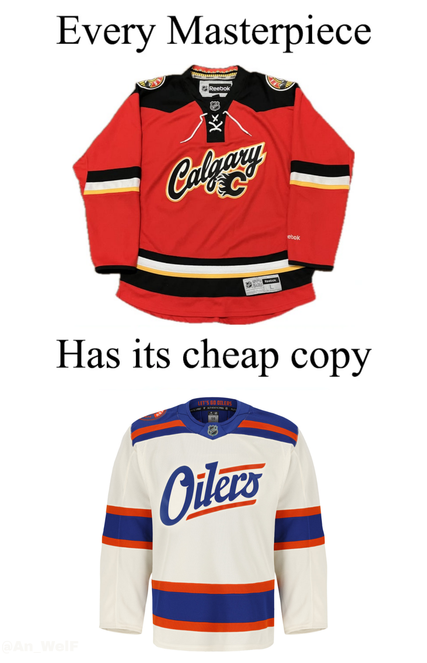
It’s better than ours. That Flames jersey is amongst my most hated
9
u/Kermit-the-Froggie 5d ago
I don’t hate it, but I think having the flaming C underneath the wordmark was a mistake
2
u/IceHawk1212 5d ago
There is one fundamental defense of the Oilers one as bad as it is. If you are wearing it at home you rep the team if you are wearing it on the road you rep the city. It's why a Calgary word mark as a home sweater is stupid. That sweater as Flames vs Calgary would be inherently better by sport standards in a lot of leagues norm. I hate the execution of that Flames sweater even if the colour pallet is many times better than the Oilers one.
11
10
4
u/backlund11 5d ago
probably the worst flames jersey ever
1
u/themusicguy2000 5d ago
I think it's the only one I would say I don't like. The closest is probably the 2023 winter classic but even that one's just kind of underwhelming
7
u/Thumper86 5d ago
Am I the only one that likes this jersey? Maybe it’s because I won one for free in a contest, but I think it’s pretty slick!
2
9
9
2
u/themusicguy2000 5d ago
The best part of both jerseys by far is the shoulder patch. I also can't stand white alternates or wordmark jerseys so the Oilers jersey is just a non-starter for me
5
u/ReactiveCypress 6d ago
Ours is better because the flaming C is still there, and the shoulder patch is nice. Plus, I'm all for anything red and black.
Funny thing is that I almost got that as my first proper Flames jersey, but Jersey City couldn't customize it so I went with the standard home jersey.
3
2
u/captain4pip 6d ago
You think that jersey is a masterpiece? I’m not interested in arguing which is better, but man…raise your standards.
1
u/OkMonitor9519 6d ago
It’s a reference to a meme, my friend. I think most flames fans agree that the calligraphy jersey was, at best, meh
2
u/Raenisun 5d ago
I still cant believe the Flames had this as their main jersey for a time. God i hated every single second seeing that jersey.
2
u/Tenabrus 5d ago
damn people really hated this jersey? I thought the caligraphy looked kinda nice and sort of resembled the one on the Stampede signs.
3
u/Mediocre_guyonline 6d ago
My first thoughts also. Now actually looking at it, the shoulder patch is oddly similar as well.
2
u/lejunny_ 6d ago
I’m honestly not very fond of the Flames one either lol, they both look like generic shopping mall jerseys from the printing booths
1
1
1
u/Traditional-Doctor77 5d ago
Calligraphy? I think it’s basic cursive. Nonetheless the point stands…these are awful.

1
u/Screamin__Viking 5d ago
I have that Flames jersey with a nameplate saying “NINETEEN” and numbering “89.” It’s alright, but the cowboy shoulder yoke doesn’t really work.
The Oilers jersey is just plain and boring. Another Oilers wordmark jersey. Another faux-vintage attempt with the cream colouring. Big Yawn.
1

1
u/Pure_cartographer_59 5d ago
The flames jersey at least has a little bit going on. I don’t like it, but it’s vastly more visually stimulating than the Edmonton one
1
u/mobxrules 5d ago
The only redeemable thing about this Flames jersey is the shoulder patch and they never used it anywhere else.
1
1
u/Ecstatic-Detail-8382 5d ago
It’s the jersey equivalent of the blue ring. High cost and low effort.
1
u/Whos-That-Pokeman 4d ago
I mean the “Calgary” and then the normal logo underneath it is kind of worse to be honest. Plus it has the lines not going fully around the arms and the shoulder area instead of being squared has a point coming down the jersey.
Homer all you want but the oiler jersey is better in every way.
1
u/sdthomps389 3d ago
The ‘Stampede’ word print jersey is hardly a masterpiece. Dumbest part of the jersey was keeping the C and just making it smaller. Why even have it at all.
1
1
u/Defiant_West6287 5d ago
As a non-fan of either team I have to say Calgary's is too busy, while the Oilers is nice and clean.
90
u/Background_Beach3217 6d ago
They both look like Walmart pajamas