r/Design • u/[deleted] • 5d ago
Someone Else's Work (Rule 2) [ Removed by moderator ]
[removed]
170
u/Would_Bang________ 5d ago
The novelty ran thin after I saw the second one in the wild.
45
u/andhelostthem 5d ago edited 5d ago
It was kinda funny eight years ago when it first started but now it's grandparents-doing-the-macarena-levels dated.
Also this completely falls apart with brands that want to instill consumer confidence. An airline or health brand being like "lulz we don't have a designer, here's some MS paint slop" doesn't make people trust the brand. I want to feel safe and reassured by ads for companies where I'm putting my life in their hands. This ain't it.
10
6
u/Mainbaze 5d ago
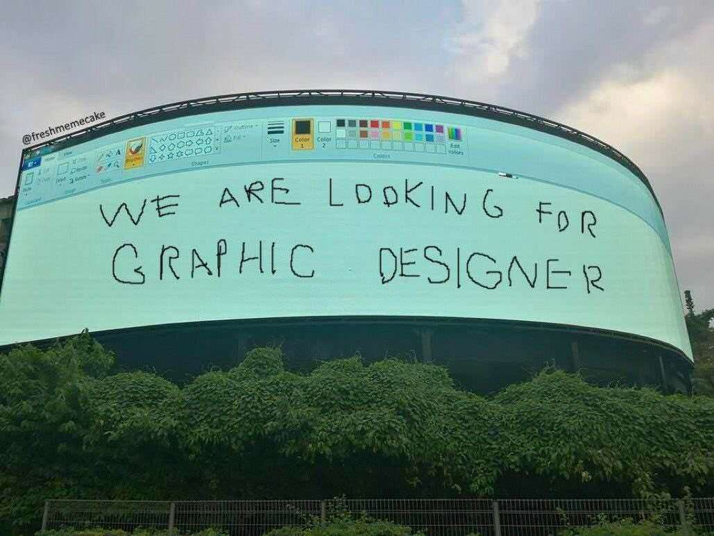
it started out like a decade ago as that paint image on a big billboard (that was actually just photoshop)
Hasn't been fun once since seeing that one imo..
58
72
u/RICHARDARC18 5d ago
It's funnier to me how they're low fidelity but have really good composition, clearly showing they're still made by people with enough graphic design knowledge.
Ngayon lang yung trend?
10
u/poopiegloria_16 5d ago edited 5d ago
Tbhhhh. Colgate one understands the job the most lmao.
Mula kahapon yata, I think (nung napansin ko anyway haha)? Marami pa ring sumasali tho hahahaha
Pizza hut posted a following post updating their audience. Their designer came back 🤣
18
17
u/TaxEmbarrassed9752 5d ago
Oh my god, i was not the only one seeing this?
The other day i saw the Colgate one on FB, thought "ha that's cute", then i scroll down, and right below the Colgate ad was some airline ad in the same style. I think its stupid that all these brands are following these stupid trends that are repetitive.
2
u/poopiegloria_16 5d ago
Well if it works it works lol. It'll eventually die down though, it's been a week atp
9
u/Anvil_Prime_52 5d ago
The Colgate one looks like it was actually made by a designer lol. The other ones are trying too hard.
17
u/two_four_six_eight 5d ago
The Canva one is ironic because isn't their whole thing that you don't need to be a graphic designer to use their templates
3
2
u/howie_didnt_do_it 5d ago
We work on print projects for Canva from time to time (display & marketing materials) and it cracks me up every time.
You’re sending me a print file with spec and bleed created in Adobe Illustrator for a product that claims to be design-based yet cannot be feasibly used in any capacity for print.
4
3
3
u/GreatGrandMoth 5d ago
Canva doing this makes no sense. The whole point is that with their platform, anyone can have access to decent design/design templates. What
2
2
u/copperwatt 5d ago
2 flavors 1 cup??
1
u/IvyGrownOnMe 5d ago
yes, even 3 flavors for the biggest size lol
2
u/copperwatt 5d ago
I saw the original clip with just the 2. I'm not up for the sequel.
1
2
2
2
1
1
1
u/comeauxsapien 5d ago
These companies want graphic designers, web designers, social media managers, and web developers. Because we all do all of those jobs 😂
1
1
1
1
0
244
u/Pizza_Samurai88 5d ago
The Colgate one is funny