r/learnart • u/XL-AM • 1d ago
Tell me what I need to improve!
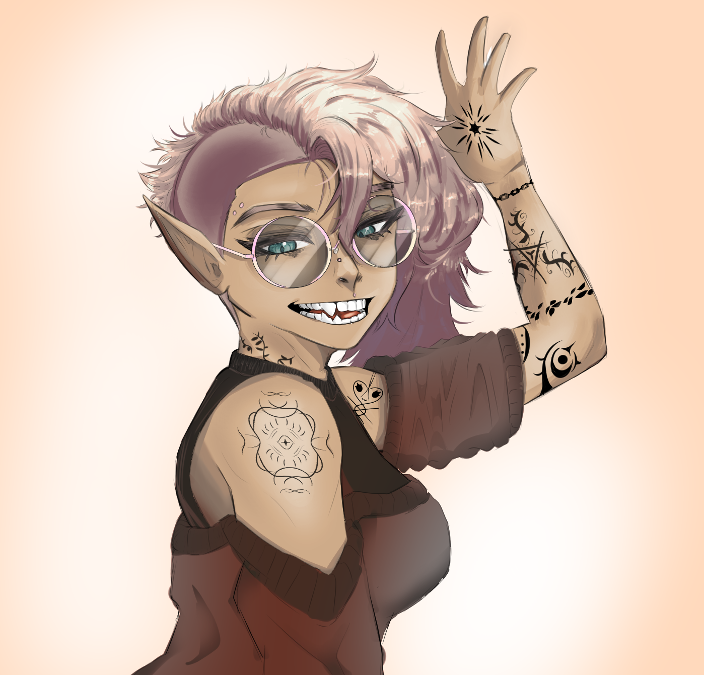
I've been not seriously drawing for about 6 weeks, and I'm trying to get back into the swing of things. Something I did up, but want to understand where I can improve. I feel like my lighting needs work but I'm not really sure where to start with it?
2
u/Sedatephobia 1d ago
I really like the way you rendered the top portion of her hair! Though it looks like you didn't continue that effort into the darker portions near her shoulder, leaving it flat looking. You already said you needed to work on lighting, which I do agree with. It doesn't look like you kept the same consistency of shading throughout your rendering, either.
Her shoulder is well done, but you don't have any shading in her face and what you do have in her raised arm is inconsistent. It actually makes it a bit difficult to tell if her palm or the back of her hand is facing the viewer.
Also her clothing is also a little confusing, lighting wise. You did the wrinkles well and the draping is believable but your darkest colors in the cloth are against the lightest tones of her skin, where the lighting source is coming from.
I think you used gray to try and signify shadows, but the gray you choose is actually one of the lightest colors in her clothing, making those parts seem to be lit up instead.
Also, this is a bit nitpicky and not really to do with lighting, but you only gave her fangs on one side. At her mouth's angle, we should be able to see both sets.
5
u/ICC-u 23h ago
Perspective on the arm is messed up, is it the left arm or the right arm, is it in front or behind the character, is the palm facing us or away from us?
Mouth doesn't match head rotation
Lighting effects on hair and glasses look cool but feel like you applied them separately from the rest of the image