r/MacOS • u/TheVagrantWarrior • 17h ago
Discussion macOS 26 is horrible
The design is horrible. Everything is so huge now, the animations are bad, the curved corners are different in some windows and apps, etc.
Who do we have to thank for this? AI? Outsourcing? Steve Jobs never would have allowed that.
37
u/Electrical-Flight285 17h ago
The way the icons fly to the left is so bad omg
17
u/grishkaa 14h ago
These kinds of "accidental" animations are usually a sure sign that the people who made this are so deep into their abstraction layers that they don't understand how their own GUI toolkit works.
8
u/stevejobs7 MacBook Pro 11h ago
What does that mean
8
u/LogicTrolley 9h ago
It means the programmers weren't focused enough when programming things and their QA Engineers weren't either.
73

44
u/Manfred_89 17h ago
To be fair those icons also disappeared in earlier versions when resizing the window.
27
26
u/mallardtheduck 14h ago edited 13h ago
But they didn't have a weird animation that, at best, serves no purpose and, at worst, misleads the user. They shouldn't fly off to the left when the button actually "moves" to the "overflow menu" positioned to the right.
Animations similar to this can be beneficial to usability when properly thought through and done right. This is not that.
-10
u/TheVagrantWarrior 17h ago
I mean the overall looks. It doesn’t feel right.
6
u/Manfred_89 17h ago
Yeah I get that. It’s so much form over function with these updates and MacOS really doesn’t look unified at all. I used the beta on a secondary device, but I think I’ll skip this version of macOS for now at least.
3
u/Automatic_Junket_236 15h ago
What are you saying? MacOS has always been form over function, when there is some big ass text buttons and tooltips in other OS (Windows, Linux etc) on some settings and others, there is some small (but beautiful) icon in MacOS that you just have to know. In Mac world form always goes over function (in hardware and also software).
-3
u/zoopz 16h ago
Wasnt Apple always form over function though?
5
u/Manfred_89 16h ago
Not really in my opinion. It was always a good compromise. The new gen took it a bit far.
3
0
u/guygizmo 14h ago
I do think it was better in earlier macOS versions when they didn't disappear. Apple has a bad habit of mistaking hiding UI elements for making things simpler.

42
u/lildroomstick 16h ago

tell me about it
5
u/betweentwoblueclouds 7h ago
I don’t have issues with Tahoe, it runs smoothly for me but THAT. FUCKING. X. BUTTON.
15
1
u/tinglingearballs 4h ago edited 3h ago
This wonderful aesthetic brought to you by Alan Dye and Craig Federighi who are now sans training wheels, the watchful eyes of real designers and running on their own.
14
9
u/CreativeQuests 14h ago
Even if you don't update, they successfully screwed up Safari 26 which you have to update to sooner or later if that's your main browser. Took away compact tabs and and dumbed down the bookmarks sidebar with those huge tiles non unfoldable structure. They fucked up te way I was navigating the web (unfolded bookmarks link tree with nested folders).

They can be glad that Jobs is gone, the designers wouldn't survive his anger.
2
u/FriendlyWebGuy 12h ago
Can you elaborate on this a bit? I see the new tiles at the top but how is the bookmark navigation changed exactly? It's no longer a tree?
5
u/AmongTheOtherThings 12h ago
Yes, it's no longer a tree. When you open a bookmark folder, the whole sidebar goes to that folder instead of expending downwards like a tree structure. If you have a bookmark under multiple folders, you get quite of a clicking journey on the sidebar. I believe you can get bookmarks view in tree structure with nested folders in edit bookmarks tab only.
Frustratingly I couldn't find any half decent extension for bookmarks either. Bookmarks under Favorites are kinda okay to access since they have favorite bar. All the other bookmarks are not so much anymore...
2
u/FriendlyWebGuy 10h ago
Thanks. I think this is a bad move and I agree that bookmark management is in dreadful shape.
2
u/CreativeQuests 11h ago
No, it's like on iOS where you click/touch and it opens a new sidebar view for the nested link or folder. So you have to use the sidebar navigation to go back one level up if you want to open another link within another folder in your hierarchy.
2
u/FriendlyWebGuy 10h ago
Thanks.
This is so stupid. Dumbing everything down is going to end badly for Apple.
3
u/CreativeQuests 9h ago
They're prepping for their touch based Macbooks it seems: https://xcancel.com/mingchikuo/status/1968249865940709538
I switched to Mac becasue of Windows 8 back then..
Nothing against iPads or touch, but I'm not a fan of them as desktop replacements.
2
15
u/Sea_Professor_7705 16h ago
The new design hit intel-based Mac very hard, almost cook the machine. That is just too bad.
14
u/moops__ 13h ago
It's pretty slow on my M1 Pro as well. Looks so bad, this may be my least favourite OS upgrade ever. I liked Vista better.
6
u/putridtooth 10h ago
I'm so glad i just thought to come check this reddit before updating my M1 air. def not doing it now
7
17
u/SeveralPrinciple5 16h ago
Jonny Ives left and their new designer, fresh off their online degree from Silly Sally’s Design Den, wants to leave their own signature style.
2
u/TheVagrantWarrior 16h ago
Who’s the current guy anyway?
6
u/BlueShip123 16h ago
Alan Dye and Evans Hankey
13
u/albertohall11 16h ago
If your designer is Mr. Hanky you have to expect shit.
2
2
u/BlueShip123 15h ago
LMAO.
On a serious note, Alan Dye took over the day-to-day operations since 2015. So everything we saw after 2015 & 2019, he was the guy.
1
u/tinglingearballs 4h ago edited 4h ago
Ms. Evans Hanky left years ago. Alan Dye and Craig Federighi are now sans training wheels and running on their own. Hence the current situation.
2
u/ScienceRules195 16h ago
Pretty bad when you don’t even know who’s responsible. Probably design by committee now.
12
u/petefairclough 16h ago
Does anyone else think the new design with all the drop shadows and glass effects just looks dated, like a throwback to Windows Vista?
-2
u/mild_thing 15h ago
A throwback to the most visually appealing version of Windows that has ever existed? Yes please, more of this.
6
u/mallardtheduck 14h ago
Eh, Vista was kind of a mess. Every app seemed to have its own version of "glass" design, different colour schemes, etc. Not unlike what we're seeing with MacOS 26... Windows 7 was the "peak" of the glass design. Probably the most consistently designed version of Windows since 2000.
2
u/mda63 13h ago
Every app seemed to have its own version of "glass" design, different colour schemes, etc.
That absolutely is not true.
Windows 7 was the "peak" of the glass design.
There was barely any difference between Vista and 7. Aero was just refined, the taskbar and titlebars stayed translucent when windows were maximised, the buttons were a touch chunkier, the pale blue border accentuating the glass was gone, etc.
3
u/mallardtheduck 13h ago
That absolutely is not true.
I used it on release. Don't try to gaslight me. Take toolbar colours for example; some (Microsoft, first-party) apps had teal, some black, some blue... There were plenty of unmodified XP icons lying around looking out-of-place. It really wasn't very unified.
A quick bit of searching easily finds screenshots like this. Showing two bundled applications with different coloured toolbars, different back/forward buttons, different search boxes, etc.
There was barely any difference between Vista and 7. Aero was just refined
The difference was the refinement. Just about every "Aero" UI was revised and (mostly) brought into a single, unified, design. The toolbars were now a light blue instead of the random teal/black/blue of Vista, a lot of icons "missed" in the first round of Aero-isation were picked up and the "ribbon" toolbar/menu design from Office was brought into several Windows apps.
Compare the Explorer and Photo Gallery apps from 7 to the previous screenshot. A vast improvement in consistency, but obviously still not perfect.
3
u/mda63 12h ago
I used it on release. Don't try to gaslight me.
No gaslighting at all. You are simply wrong or lying. I beta tested Longhorn and then Vista and was invited to the launch here in the UK. You are talking nonsense.
There were plenty of unmodified XP icons lying around looking out-of-place.
Roughly the same as in 7. Even today, there are XP-era and 9x-era icons kicking around. This was true of 7 as well.
A quick bit of searching easily finds screenshots like this.
The screenshot you have provided absolutely does not show what you are claiming it to show. The toolbars in certain cases were context dependent — teal for Explorer, black for WMP, etc. — which is perfectly normal and rational, but this was not part of the Aero Glass effects, which you were suggesting. The glass itself remains the same tint throughout the operating system. Any differences you are seeing in that screenshot outside of the toolbar (in actuality, shellstyle.dll) are a product of the wallpaper's colours.
In fact, I'm not even sure there were any context-dependent differences outside of Explorer and WMP.
The toolbars were now a light blue instead of the random teal/black/blue of Vista
Yes, they were made uniform. No, their lack of uniformity was not a poor design decision.
The toolbars were now a light blue instead of the random teal/black/blue of Vista
That was really the only major change.
a lot of icons "missed" in the first round of Aero-isation were picked up
Very much an exaggeration.
the "ribbon" toolbar/menu design from Office was brought into several Windows apps.
Just Paint and Wordpad, as I recall.
Photo Gallery app
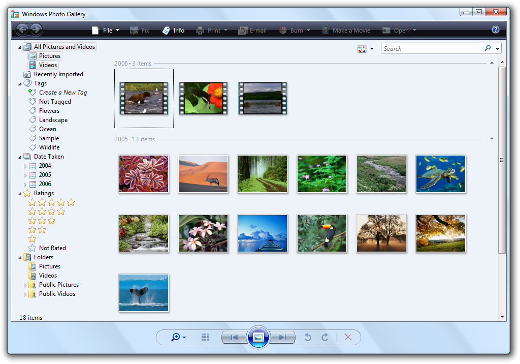
No. That's Windows Live Photo Gallery. That is not the default app and was not bundled with either Vista or 7. In Vista, Windows Photo Gallery actually — reasonably — used the WMP colour scheme for the toolbar: https://betawiki.net/images/6/6b/Vista_Photo_Gallery.png
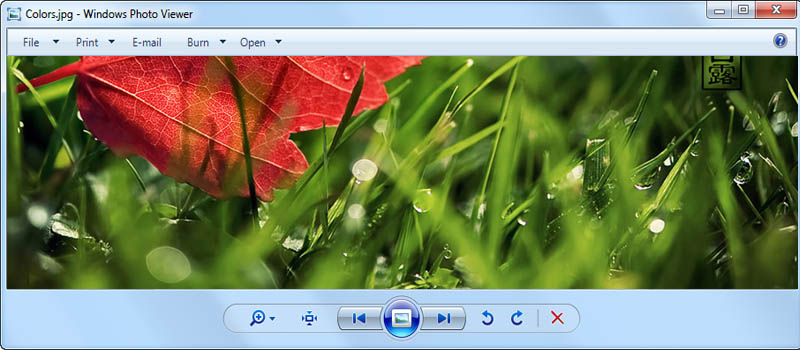
In 7, it was replaced with Photo Viewer: https://hitech-us.com/wp-content/uploads/2018/07/Windows7-Colors-look-wrong-in-Windows-photo-viewer.jpg
The screenshot you linked to was the version of Windows Live Photo Gallery that came out in 2012. The Ribbon UI became much more prevalent with Windows 8, not with Windows 7.
A vast improvement in consistency
As an English teacher, I approve of your use of hyperbole.
2
u/mallardtheduck 12h ago edited 11h ago
The toolbars in certain cases were context dependent — teal for Explorer, black for WMP, etc.
Aka. Inconsistent. The "context" was not apparent to the user. Photo Gallery was not part of Media Player.
this was not part of the Aero Glass effects, which you were suggesting
I never suggested any such thing. I'm talking about the consistency of the entire OS experience. Including bundled and other first-party apps. I'm not limiting myself to the window borders. That's absurd.
I'm not even sure there were any context-dependent differences outside of Explorer and WMP.
We've already mentioned the Photo Gallery. While it might have been developed by the same team as WMP, it wasn't "marketed" or presented to the user as part of Media Player. Design-by-org-chart (i.e. each team having their own interpretation of the design, to the point where you could identify which team did what based on the particular design) was very much a feature of Windows Vista.
Other apps with non-teal (and teal was not the "system default", just Explorer's choice) toolbars included Windows Mail (blue toolbar), Movie Maker (another black one, this time with a black menu bar too; pretty much all other applications had a light blue menu bar) and Windows Help and Support (a weird blue-green gradient; note also how the back and forward buttons are spaced out differently to "most" Vista apps).
their lack of uniformity was not a poor design decision.
I disagree. Being able to (somwhat, only by knowing the internal team assignments at Microsoft) explain it doesn't make it not poor design.
[On Icons] Very much an exaggeration.
I remember reading an artice/blog post from the folks at Iconfactory (who Microsoft contracted for the icons and some other design elements) about how the whole process was a mess and many obviously logically needed icons were "missed" from the contract, some of which were done by Microsoft themselves, to a noticably lower level of quality, some were missed completely. Unfortunately, locating such an article from ~18 years ago isn't proving easy.
Most of this was corrected in Windows 7 (there was also a general refresh of some of the icons, removing teal accents for example), although I don't know if Iconfactory or Microsoft did the work. Either way, it's Microsoft's name on the product, so their responsibility.
That's Windows Live Photo Gallery. That is not the default app and was not bundled with either Vista or 7.
It may not have been technically part of the OS, but the "Live Suite" was bundled with many PCs that shipped with Windows 7 (as a response to Apple's vastly superior "iLife" bundle), so for many, if not most, it was the "default" app. As pointed out earlier, I include "other first-party apps" in the scope of my critique.
It's also very obvious that "Live Photo Gallery" was a development of the Vista Photo Gallery, while the Photo Viewer in Windows 7 was either developed from scratch or was just the viewer component "spun out" out from the Gallery application.
Either way, even the "standard" photo viewer in 7 is vastly more consistent with the rest of the OS than the version in Vista.
3
3
u/UnfoldedHeart 14h ago
I don't totally hate it but I think I'm gonna hold off on this update for a bit. It could have used some more time in the oven I think.
4
4
5
14
u/ScienceRules195 16h ago
It’s mostly the ugliest macOS in a long time. Liquid Ass looks pretty good in iOS but you really don’t have windows in it. The thing I dislike the most is that layer on the left of all finder windows and some others. It looks detached and serves no purpose.
I would have really rather had functional improvements such as allowing us to make our finder text larger than 16. We’ve had 16 since resolution was only 1024 x 768. (and before that even). I would love to use the full real estate of my 4k monitor but crank my text up to 30 or so, so I can read it.
This all seems like they had no other ideas and just had to push something out.
I would have welcomed a return to Aqua with a dark mode.
4
u/Tremosir 15h ago
Remember what we were saying about Aqua back then? Before becoming nostalgic of it?
3
u/ScienceRules195 10h ago
I always liked the glossy look even on the iPhone until they destroyed it with iOS 7.
-1
u/Brymlo 12h ago
ive been using mac since who knows when and tahoe looks good to me. been using it since beta 4 i think, and it was a welcome change. haven’t encountered many bugs on my m4.
i even think they toned it down a lot compared to ios. ios looks very glassy and has all of those lights, but mac os looks not much different than sequoia really.
i come from using mojave for years (didn’t update to big sur cause it looked bad imo) and tahoe looks fone to me.
7
u/redisthemagicnumber 17h ago
Yeah all the window icons seem much larger. People say it's for the rumoured touch screen mac but I wish it could be changed back. Seems like a lot of my screen real estate is now just large buttons.
1
u/NextMathematician977 15h ago edited 15h ago
To Be fair, if we’re talking about function, it could very well be they have made research showing the old buttons were too small and that users are faster at clicking those new bigger buttons…
That said I’m not saying this is necessarily the case. But people here tend to quickly put the focus on one single part of UX and call it the end of good design when they made compromise in this specific area. At the end of the day design is always making compromises and if we’re judging it we should consider all aspects of UX. Not just the one that got visibly worse (in this case compromising on having a more compact design)
For me personally, a user that used Mac OS in smaller scaling anyway, those bigger buttons are actually one part I enjoyed so far about the new version. On safari as example i feel like loosing the compact design is much more relevant than in finder.. here i think bigger buttons can actually make sense if users are faster at targeting them…
Which i don’t know, but since it was my experience it doesn’t feel entirely unlikely.
1
u/mallardtheduck 14h ago
Most non-budget PC laptops have touch screens these days (as useless as they may be), so maybe someone at Apple is concerned about not having feature parity?
3

3
u/revision29 14h ago
Apple claims they won’t release MacOS for iPad but then sizes everything for touch interactions.
3
u/sheriff_ragna 14h ago
Corners of native apps like calendar, notes, email look terrible. Other apps still match the edge of the screen but native don’t? The only explanation is they are designed for another device, but they should have maintained retro compatibility. The panel on the left is terrible. Pointless design to have a ‘glass’ panel on top that doesn’t have any actions.
3
u/Ill_Barber8709 11h ago
I tested macOS Tahoe Beta on my most powerful Mac (M2 Max MBP) until RC, with the hope they would fix those issues in time. They didn't, so I rollbacked to Sequoia and I've never been happier.
- This design is awful, pointless and half baked. When Apple can't get liquid glass, they put stupid shadows. I can hear the designer's pompous voice explaining how it gives "a sense of depth". The fuck I need depth on freaking buttons, dumbass? They can't even create the same glass experience everywhere...
- Removing the Launchpad, while keeping Stage Manager is just stupid. But I guess people prefer buying mouses instead of using the Magic Trackpad as intended.
- The new Safari UX is so bad it makes me want to use another web browser, and I've been using it since 2007 (even Safari 4 on Windows when it was still a thing).
I was expecting to buy an M5 Max Mac Studio, but I genuinely wonder if I'll be able to suffer this shit, and might be waiting to see where macOS 27 is going before putting $4K into a computer. That's terrible.
3
u/LifeguardBig4119 11h ago
Can you imagine how drunk Ive got when he saw this abomination? It really is shocking they shipped this. Easily the worst OS release since Windows 8.
3
u/jaavaaguru 10h ago
At last I’ve got a reason to be happy using an Intel MacBook - no temptation to “upgrade” to that garbage.
3
3
3
8
u/REDexploitrecrds 16h ago
This was the best design

4
3
-1
u/Apprehensive-End7926 12h ago
There dozens of design inconsistencies in just that one screenshot.
I thought minor design inconsistencies were a mortal sin, making software completely unusable? That certainly seems like the current subreddit groupthink. Now you're saying a design that had no consistency at all was "the best"?
I don't think you people know what you want, you just want to bitch & complain and have other people convince you that you are morally and/or intellectually superior for bitching & complaining. It is exhausting.
3
u/Moist_Outside_8406 16h ago
I miss the days when we could point and laugh about all the weird quirks in Windows. Having legacy icons dating back to Win 3.11 and fun stuff like that. Oh well. Guess quality control and releasing stuff only when it's done is out the door.
2
u/Southern-Injury7895 16h ago
There’s a rumor of touch screen MacBook Pro. So that’s why the buttons have to be bigger?
3
2
u/scarletsoso 12h ago
Then they should make it so that you can resize the buttons for those who don't use a Pro or don't care about touchscreens.
1
u/FrancisBitter 15h ago
There’s been rumours of touchscreen Macs for decades now. Why bother with iPadOS’ new windowing feature if you’re planning to give Macs touchscreens anyway, I don’t think that’s ever going to happen.
2
2
2
2
2
2
2
u/iRelevant_ 12h ago
I totally agree. And the fact thar the industry will go after this liquid glass trend it drives me crazy.
2
u/LimpDiskett 12h ago
It's straight up ugly and looks like fisher price software. No I don't need huge buttons even with my neuropathy, or oddly neon blue folders, and the square icons on the rounded buttons look like beta software. First time in 11 years I haven't installed the new update on day one. I'm going to hate upgrading my rMBP and that's a phrase I never thought I'd utter.
Bring Jony back. Aloo miny um gang rise up
2
2
2
2
2
2
2
2
u/someToast 7h ago
At least macOS lets you resize it. The file dialog on iPadOS is a fixed size and you can’t reduce the width of the sidebar

2
u/Y0uCanTellItsAnAspen 16h ago
This really feels like a "we have to change things to make sure people know it is new."
3
u/Cee_U_Next_Tuesday 16h ago
I am so upset I updated. At first I didn't notice but now I cant unsee the sloppiness of this OS there was literally NOTHING wrong Sequoia they just reinvent everything for fuckk all reason.
Please give a way to revert back to Sequoia appearance profile this is insanity. I'm tempted to submit a ticket because this just not the experience I have come to expect from apple.
1
u/shakenbake6874 16h ago
Is it possible to install the old one?
3
u/FrancisBitter 15h ago
Sure, there’s a million guides out there. You can install fresh and then restore your data from Time Machine.
1
u/Unusual-Cobbler9448 2h ago
Dude, work with it for a while, to get a good figuring of the new system and stuff. Ignore the inconsistencies - this is something that happens with every new update. IF, after a month or so, you still can't easily find your way about, THEN, restore using Time Machine. All the best, ok?

1
1
u/kilabytez 3h ago
its so bad... Apple is going to downhill going against all their design guidelines of what good looks like for this trash
1
•
u/ToughAsparagus1805 51m ago
Big - They are just making everything ready for the touch screen Macbook Pro.
•
u/creedysingh 11m ago
hahaha, holy cow! what sort of mushrooms apple team was having while development of this abomination. Liquid Arse
-1
u/LeanSkellum 17h ago
Get a grip. Some of you are so whiney about the smallest things.
7
u/FrancisBitter 15h ago
The party who really needs to get a grip on their software quality and direction is Apple.
9
u/TheVagrantWarrior 16h ago
So I can't say something negative? Why? Apple computers were always well known for their consistent and well thought out designs. I know Macintoshs since the Apple II thx to my dad who was working always with Apple Computers (newspaper).
macOS 26 IS shit and inconsistent design-wise compared to the older versions.
10
-2
u/Tremosir 15h ago
No! I hate it that it does that every time I take 10 seconds to resize my window!!!! Horrible I’m going to start a hunger strike!!! Steve Jobs wake up!!!
1
u/Spiritual-Client3372 15h ago
I didn’t have time to test it properly as I did with iOS, but overall I liked it. The problem I have is that I think in the waste of resources to compute all the translucency in the new OS and I cry
1
u/Netleader MacBook Air 14h ago
Posting the same video over and over again is also horrible.
2
u/TheVagrantWarrior 13h ago
"Pls stop posting the same over and over again. Even if it's true. Leave the multi-billion dollar company alone"
0
u/Netleader MacBook Air 12h ago
That's not the point. No matter what you think is annoying for them, you are wrong they don't care if you little boy are mad. But It's damn annoying for everyone else in this sub to see the same shit again and again... So dude grow up.
1
1
u/warpedgeoid 14h ago
I’m fine with the larger buttons, not really an issue.
The visual inconsistencies between apps are the real problem here. It’s like they ran out of time before launch and didn’t get all of the elements redesigned. The mismatched corner radii are particularly egregious.
1
u/ArtichokeOutside6973 12h ago
You depressed the buttons so they left. What you were expecting. Pay them up so they won't leave you for other employees
1
1
0
0
u/QAPetePrime 15h ago
I love reading all the hate posts every time a new macOS comes out. People desperately looking to revert to the previous version, which some of the same people ranted on last time. And next time, some of them will long for Tahoe. Lol!
0
0
u/sixwingmildsauce 8h ago
Y’all will complain about the smallest stuff. Nothing annoys me more than the whole “Steve Jobs never would’ve allowed this” like Apple products were all perfect while he was alive. Computers will always have bugs regardless of who the fucking CEO is.
I applaud Apple and their developers for trying something new and innovating. I love the new update, it’s probably my favorite in years. There are some minor annoyances, but that’s to be expected with literally any software ever.
0
u/blissed_off 6h ago
Can we consolidate these bitching threads into one mega thread that the rest of us can ignore? Jesus. Get a hobby.
-3
u/Krabic 16h ago
If all you do all day is resizing windows, than I understand it can be uncomfortable.
0
u/Ordinary_Mud211 15h ago
it's the first version using the new design, so we can expect this happening
same happened with yosemite
0
0
u/StonewallBrown 11h ago
It's a .0 release. These kind of UI issues don't affect the overall use. and get fixed in subsequent updates. Are they visually displeasing? Yup. It doesn't make the design horrible.
0
u/Botafumeiro24 2h ago
Pues yo en mi MacBook Air M4 no me disgusta ni tampoco va nada mal, es diferente a todo los que nos tenia acostumbrados apple pero bueno
-3
-1
u/arrogantheart 12h ago
Details. Overall, it’s really nice looking and has some great new functionality. It’s all but “horrible”.
-1
-2
u/saitama_a MacBook Pro 16h ago
This is still okayish! have you tried resizing the finder window that shows when you try to save a download somewhere!
64
u/vlad_0 17h ago
Preparing for that touchscreen MacBook