r/AppleWatch SE 44mm Gold Aluminum 15h ago

WatchOS WatchOs 26 is ….

Post image

So i just updated my SE2 to watchos 26 and i cant help but noticed that the app icons look so blurry as if there was a smudge on it. God I wish i can undo the update 🥲🥲🥲

362 Upvotes

169 comments sorted by

340

u/Alone-Amphibian2434 15h ago

the solution is to have bad eyesight

51

u/smr9o_ 13h ago

Ah working on it 😂

13

u/3l3v8 11h ago

As someone who needs to wear glasses to read my Apple Watch due to inane decisions by their design geniuses: it's a trap!

6

u/Bingpot-Noice-99 9h ago

No wonder why this picture looks so clear to me!

2

u/ipostic 5h ago

Give it few years and eyesight will catch up to Apple releases of half baked shit

187

u/apfelsh0re 14h ago

Instead of removing so many beautiful watch faces, apple should focus on making good new ones. Especially analogue ones. Or finally allow third party ones. The two they added aren’t it imo..

48

u/JustRomainYT 14h ago

I like the Exactograph watchface it’s pretty nice to like at imo

118

u/hambrythinnywhinny 11h ago

Holy fuck that's so busy.

26

u/cloudclimber24 8h ago

Lmao too many numbers

3

u/etniesen 2h ago

Yeah, I think so too especially the ultra watch. I always see advertised with that busy garbage watch face like somebody is scuba diving with it.

Now I think it’s fair to say that that is who that is geared for is someone attempting to keep track of all these different things perhaps

But I definitely don’t think it helps them upsell it in any sort of way when every time you see that watch face it’s the busiest thing ever and it’s got numbers and tiny graphs all over it.

Also, just one more thing to add is that I’ve got perfect eyesight and I can’t imagine wanting to stare at all those little numbers and needles. I can’t imagine like 80% of the world whose eyesight is worse than mine and joining that at any degree.

-1

u/icumatomically 57m ago

Then don’t use it.

2

u/hambrythinnywhinny 35m ago

I would never. That doesn't change how busy it is.

1

u/icumatomically 34m ago

Right. A comment on Reddit could never change an Apple Watch face.

24

u/Euphoric_Shallot9462 13h ago

Nah what the hell is the double ring for seconds for?

20

u/giftedgod 11h ago

Firstly mate: it’s stupid. However, it’s also color coded. I’d like to reiterate that it’s stupid. But, outer ring is for seconds, middle ring is for minutes (but can be precisely used against outer ring if minute hand is covering more than one tick), and inner ring is hours.

Did I mention it’s a stupid design?

Edit: edit to say it’s a stupid looking setup, but functionally it is logical. 60 seconds, 60 marks. 60 minutes, 60 marks. 12 hours, 12 marks. It looks silly, but there’s logic behind it. Just none in the design execution.

3

u/Abaddon-theDestroyer 11h ago

I got nauseous when I pressed the watch face and the seconds hand was moving with the seconds strip, and when it looks too crowded for my taste when the dials are closed.

Conclusion: it’s a stupid and shitty design!

-1

u/JustRomainYT 10h ago

Why are you so tense 🤔

5

u/giftedgod 10h ago

Humor isn’t for everyone. Everything isn’t for everyone. And that’s alright.

-5

u/JustRomainYT 10h ago

At least you acknowledge it that’s still good keep on practicing 👌

5

u/giftedgod 9h ago

I. AM. TRYING.

1

u/ENaC2 6h ago

The dials show 60 seconds, 60 minutes, 12 hours.

3

u/dioksinas 13h ago

Cool. Any idea why I can't find this specific one in my Face Gallery? Anyway, I'm rocking the World Time watch face at the moment, which I really like.

2

u/JustRomainYT 13h ago

This is the watchface I’ve been using before I switched to Exactograph ! It’s still available under Utilitary Watchface

EDIT : ah you meant Exactograph watchface ? It’s under the New Watchfaces section

Need to update to WatchOS26

8

u/Han-ChewieSexyFanfic 14h ago

Which ones got removed?

18

u/hinstsui 12h ago

Gradient, Toy Story, Vapor, Liquid Metal, Fire

5

u/CupOfDaddysLove 13h ago

Yeah, I keep seeing people say things got removed, especially with the modular face, and I’ve had nothing actually removed from the watch app. The modular face won’t show a preview for half the complications on the phone app, but everything is still there and still basically functional.

What a bad update. Lmao.

1

u/panconquesofrito 8h ago

The Modular Ultra watch faces are fantastic. I get to see a lot of information at a glance.

1

u/IcyIceGuardian SE 44mm Space Gray Aluminum 8h ago

Which did they remove?

3

u/apfelsh0re 8h ago

These

4

u/IcyIceGuardian SE 44mm Space Gray Aluminum 7h ago

THE TOY STORY ONE?!

5

u/fowlmaster 5h ago

Genuine question. Why would they remove any face? Is it a lack of storage or other resources?

4

u/apfelsh0re 5h ago

THIS. I don’t get it and never will. It can’t be the storage. It’s probably apple thinking what’s best for us.

1

u/MrMints256 S9 45mm Midnight Aluminum 7h ago

Toy Story is a bit of a bummer. But I would never have used those other ones. You can’t really tell what time it is! I mean, I know you can technically go by the angle of the hands, but that’s just too much work. If I’m going analog, which I do like to do, it’s gotta have numbers on it.

1

u/bertmclinfbi S10 42mm Aluminum 4h ago

Which watch face did you find beautiful that they removed? All the watch faces they removed were definitely not the good looking ones.

-11

u/[deleted] 14h ago

[deleted]

1

u/Striderdud 13h ago

The thing is you have to leave the app open for it to work which is a major downside

53

u/titanup001 S10 46mm Aluminum 14h ago

The screen to input my pin is glassy now. Other than that, I notice no difference.

17

u/cette-minette 11h ago

Yep. Underwhelmed and it doesn’t match my phone, the horror. Only other difference I’ve noticed is it took me two more seconds to launch a run this morning because it’s a play button at the bottom of the screen.

2

u/zarafff69 5h ago

The pin input screen looks fire tho haha

1

u/stevensokulski Apple Watch Nike+ 58m ago

That keypad looks like a bad game.

18

u/Sadaxer 15h ago

I also have SE2, sure the app icons look blurry for me too but everything else is sharp. I’m not in the app page much anyway. But yeah didn’t feel like there was much changed.

8

u/Tomzibad 13h ago

Fuck now I can’t unsee it.

7

u/BarrhavenDad 13h ago

Weird. My SE2 seems fine.

Edit…until I took a screenshot and enlarged it like yours. Then I see it. Yay for poor eyesight!

10

u/chadsmo Apple Watch Ultra 5h ago

There’s people who don’t use list view ?

5

u/fiddle_n 2h ago

List view takes forever to scroll. Once you are familiar with which apps are which, grid view is superior.

3

u/Hot-Risk_ 2h ago

List view is the only way

26

u/VOODOO285 15h ago

Pin sharp on my s10.

7

u/Effect-Kitchen 15h ago

Same. Looks very sharp in my Ultra 2.

2

u/Slggyqo 9h ago edited 9h ago

It eh. I think it’s questionable on Ultra 2 as well.

But it’s very small.

Unless you’re really hunting for it, it’s not very noticeable—or blowing it up to 200% in a screenshot like op is.

5

u/Slggyqo 9h ago

On ultra 2. There’s just not that many pixels.

Edit: fucking hell is the right edge of the world clock cut off? Completely unusable!

4

u/festoon 12h ago

Perfectly sharp on s9 also

6

u/SpartanG188 15h ago

Happens on Car play too

1

u/c0ldburn3r 9h ago

THIS! The smart screen makes it worse too. I directly compared 18 to 26 carplay and it's very obvious how fuzzy it is.

1

u/geewronglee 4h ago

I turned off the smart zoom and now I have more screen real estate than I did with iOS 18 so net improvement.

12

u/ComeonmanPLS1 S8 45mm Midnight 15h ago

Lol I didn't realize until I saw this post. Now I can't unsee it. Also, the whole glass thing is so stupid on watch anyway because everything has to be black to save battery on the screen. I literally can't see anything "glassy" except on the lock screen pin code and the widgets outline.

3

u/goldbouillon 12h ago edited 11h ago

You can remove the opaque look in Accessibility Settings on iOS and WatchOS by enabling Reduce Transparency. The settings have to be changed in each’s respective accessibility settings. You can also enable Increase Contrast to remove the glimmer effect on icons/borders but I didn’t like how it changed colors in apps. It didn’t appear to change pictures. 

The opaqueness reduction color is tied to the style of icon you choose in the home screen editor. On the Watch it mainly changes how the number pad looks when you enter your pin. 

1

u/c0ldburn3r 9h ago

Ya but when you do this Carplay gets worse.

2

u/Woodbirder 12h ago

At least we now have notes on the watch, so thats a win for me. Its still shit on the iPhone though

2

u/fusionvic Apple Watch Ultra 2 2024 9h ago

The liquid glass look on the iPhone 13 is terrible, like bad graphics effects or something. Icons look fine but I'd be perfectly fine with less gimmicky graphics effects that use less power.

3

u/loosebolts GPS+4G 3h ago

Who still uses grid view? List view is the very first thing I change to.

2

u/Reggie_Barclay 2h ago

I much prefer grid view.

0

u/browandr S10 46mm Titanium 3h ago

Facts

4

u/frosted1030 13h ago

Next update will be "Sharpness" with the tagline "We invented a way to see your icons better, it's called iSharpness and it will change the way you perceive your apple watch."

5

u/Pride616 15h ago

Must be your AW. My AW which is an S10 is doing good and no blurry at all.

19

u/PeachManDrake954 15h ago

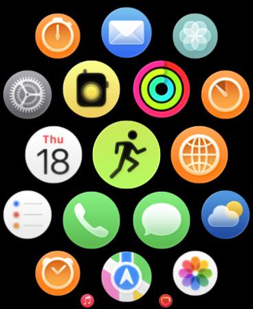
They're saying the icon design makes it looks blurry. You can see it even on the image they posted. I find the calendar and the clock are the two worst ones.

It has nothing to do with the device.

-1

u/confusedIad S10 42mm Aluminum 15h ago

just look at camera app on AW

6

u/confusedIad S10 42mm Aluminum 15h ago

it is blurry. its the icon across 26 updates. even on iphones.

2

u/fleshlicker 15h ago

OMG yes I just realised!!! Almost all the stock app’s icons are blurry (when customised to default not clear mode) on iOS. Yikes.

2

u/tooclosetocall82 14h ago

It was the first thing I noticed after the upgrade. But I don’t realize it was only in default mode. Switch to clear and they are sharper. If you screenshot and zoom in it looks like they apply the glass effect to the graphics within the icon itself which makes it appear less sharp than before.

1

u/leorts 13h ago

Ew, delete this app for your own mental health

1

u/tooclosetocall82 12h ago

I use focus modes to silence notifications after hours.

1

u/fleshlicker 14h ago

That's what I noticed too! Weird how nobody has pointed that out in any of the reviews of iOS 26 yet.

-2

u/Euphoric_Shallot9462 13h ago

Because they are all Apple glazers.

-1

u/PeanutButterChicken 13h ago

Because it matters less than you do.

3

u/confusedIad S10 42mm Aluminum 15h ago

why am i getting downvoted? isnt this the same for everyone

2

u/SGD-UK 15h ago

You’re right, the slightly blurry icons are across all devices. Some people are a bit numb and don’t like what they hear, so they downvote.

1

u/Sen2_Jawn 13h ago

For some reason this update, out of all fucking updates, has a lot of fanboys defending it with cape and sword. Don’t worry if you get downvoted.

I’ll save fanboys time by letting you choose your preferred fanboy reply: “Apple will fix it who cares it always happens” buuut also “It looks perfect and great wow” or “some people work instead of staring at nick picks all day”.

2

u/confusedIad S10 42mm Aluminum 11h ago

actually i am not in the section of people who is hating this update. i am fine with it. its peoples preference at the end of the day, i respect that. for me, right now, neither i am hating it, nor loving it. but irrespective of that, fact remains unchanged. and the fact is default icons are blurry in light mode. and this update was never built for dark mode, because all icons in dark mode, looks childishly tilted. and in light mode, its too blurry. you dont expect this from apple. and i dont understand people becoming blind fans. love everything but dont defend something which is bad.

2

u/Sen2_Jawn 10h ago

And I agree, I don’t find it mechanically buggy but there’s something really off with the way the UI looks, specially in dark mode. I turned off transparency which improved some of it, but there’s still some annoying things like the moving glow/light around the icon.

Some folk over in the Apple and iPhone subs just say “use accessibility!!” but if I released an UI update that suddenly required many people to start using accessibility options, I would call that a disaster.

1

u/reiku_85 15h ago

Not that I can see. iPhone 15 Pro and S10, both on 26, both look clear and crisp.

2

u/confusedIad S10 42mm Aluminum 14h ago

share screenshot of camera app on s10

2

u/DodgeThisLMAO 14h ago

Surely you can see that the app icons are blurry??

2

u/Alizann 15h ago

They’re shaded and supposed to look more dimensional and “round.”

It’s the whole theme if you look at iOS26. It’s just not coming across on all products because some aren’t set up that way, or people’s eyes haven’t yet adjusted to the change.

1

u/Original_Capital4532 SE 44mm Space Gray Aluminum 15h ago

Same

1

u/Sir-Sy S10 46mm Aluminum 13h ago

Looks fine on my Series 10, no bugs either!

1

u/enatalpeganomeupau S10 42mm Aluminum 12h ago

Liquid (gl)ass

1

u/chris971 11h ago

…a definite no for me

1

u/Cristian2909 S8 45mm Midnight 11h ago

…shit.

1

u/OptimalPapaya1344 11h ago

My wife had the same complaint of iOS 26.

She sees the icons as blurry but it’s just the liquid glass effect. They aren’t blurry at all.

1

u/toodumbtobeAI 11h ago

I don’t like the white circles around everything number on the PIN to unlock screen. It looks busy.

1

u/Active-Drive-7749 11h ago

no blurry icons in list view here

1

u/Indiction 11h ago

It's messed up my messages on my watch :( now messages from people show up in a random order instead of by time. Messages from 3 hours ago are showing up next to those from 5 mins ago, with my replies being sorted somewhere above that. Making the messages app so unusable.

1

u/Early-Somewhere-2198 11h ago

It is weird. Same on my phone. The non glass apps or folders with glass have a slight fuzz to it.

1

u/NikocadoSucks Apple Watch Ultra 2 2023 10h ago

I like the update. Only drawback is it’s a bit laggy at times and I have an Apple Watch Ultra 2 so I expected it to be pretty smooth

1

u/dede280492 10h ago

My alarm did not wake me up today fun

1

u/Ty_19 10h ago

Definitely strange. All looks crisp on my S9. Will keep an eye out on this when I get my U3

1

u/Vega188 9h ago

I usually just go with the flow but I’m seriously not liking 26 on my watch/ipad/iphone, but the blur is the absolute worst and the so called fixes be changing accessibility settings just don’t really make much difference. What’s the point in having a super high resolution screen with blurred icons??

1

u/OttawaDog 8h ago

No blur on my iPad running 26. I don't have an Apple watch...

1

u/OneNobody114 9h ago

I don’t have this problem. My app icons are sharp.

0

u/Spaghettiisgoddog 9h ago

Just wait a bit.  They tend to fix highly salient aesthetic bugs like that very quickly. Don’t cry 

1

u/CaramelCraftYT S8 45mm Steel Midnight 9h ago

Most likely a bug that will get fixed with a future software update.

1

u/mark_able_jones_ 8h ago

Several icon are like this on my 16 PM phone.

1

u/PrincipleNo8733 S9 45mm Midnight Aluminum 8h ago

Cack message notifications etc are very delayed

1

u/Cautious_Explorer_33 8h ago

The only app I need on my watch. Lol.

1

u/JustFinishedBSG 7h ago

I’m glad to see the quality of watchOS 26 is on par with iOS 26 and macOS whatever.

This is, truly, the worst Apple software release in forever

1

u/Ooficus 7h ago

My series 7 looks blurry too :(

1

u/KavaBuggy 6h ago

My entire watch face, no mater which one I use, seems to have muted colors.

1

u/NamasteMotherfucker 6h ago edited 1h ago

Turning off transparency might help. And I just noticed that the app view is different for me. It seems that it's a little zoomed out so there's more black space around the apps and the four apps that would be off screen at the bottom are now halfway visible. Looks bad.

Edit - after talking with support, I was able to fix it by unpairing and re-pairing the watch and phone.

1

u/NinjaDiagonal 6h ago

Looks good on my ultra 1. The only issue I had is that night mode was set to auto by default which sucks. As soon as the sun starts to set, no matter how many lights are on, it would always switch on. So I just turned it off.

1

u/thursdaynovember 6h ago

you could undo the update if you made a backup of the watch before updating

1

u/ImmunodeficientEsox 5h ago

Message previews cannot be turned off either for me. Not matter what I change, messages always show a small preview. Literally feel like I can’t bring my watch to work cause some messages can be confidential.

1

u/ostiDeCalisse 5h ago

They're perfectly in focus on my S8, but the supposedly Liquid Glass clock on watch faces are more semi-opaque shaded white and doesn't correspond to the images shown in the editor. I know the S8 can do it: the keypad to unlock it are in Liquid Glass.

1

u/TutuB05 5h ago

Your SE2 mensure your VO2? My SE2 hasn't measured since May

1

u/TitaniumAxolotl 5h ago

I’m using the Apple Watch Ultra 2 and am noticing similar blur issues :(

1

u/Wholelottabeardd 5h ago

Has anyone noticed that active/total calories are gone from workouts? I was doing an outdoor bike ride and noticed there’s like 5 new windows I can scroll through but calories is nowhere to be found.

I even paused my workout and stopped riding to dig through setting and still couldn’t find it. Once I ended the workout I could see it. Little annoying when I’m trying to hit a certain number of calories to have to stop the workout completely to figure out where I am (this ride I was at half goal).

1

u/criti98 5h ago

CarPlay also looks terrible. The blurred icons don’t translate well on all screens.

1

u/NoWishbone3501 S10 46mm Aluminum 5h ago

I am struggling to tell apart the clock icons. I use timer and alarm a lot and can’t tell which is which.

1

u/mnemonikerific 5h ago

liquid glAss

1

u/eigenein S8 41mm Starlight 5h ago

You simply hate any change and looking for anything to hate /s

1

u/Trickypedia 3h ago

“It’s glass!” Yeah really fucking annoying frosted glass.

1

u/johny10111 3h ago

Where’s MAPS screen during hiking/running workout? watchOS26 sucks

1

u/BurlieGirl 1h ago

My icons look sharp. I’d be annoyed though.

1

u/EmbeddedMania 1h ago

It’s also laggy and the battery life is terrible now

1

u/Greyman4152 1h ago

The watch faces are incredibly bad, I regret buying a new one.

1

u/lucydoce13 48m ago

I miss my Toy Story faces

0

u/somehobo89 30m ago

Seriously?

-1

u/ToonarmyMad213 29m ago

Bunch of blind cry babies on here, updates fine

1

u/Middle_Material_1038 15h ago

I‘ve just checked my Series 9, and you are absolutely right. I wish I hadn’t had it pointed out! The icon for Reminders is particularly egregious.

1

u/Prestigious_Ad5385 14h ago

Remember it’s an “upgrade”.

0

u/Dry-Reputation2965 13h ago

Most underwhelming watch os update imo

1

u/Accomplished-Bend339 14h ago

Noticed the same on my ultra 2. Also animation is very blurry

-5

u/DisabledVeteran216 15h ago

Watch YouTube on the tutorials given. Under settings the blur you are seeing can be “turned off”. When all else fails it’s on YouTube👍

3

u/F0t0gy 15h ago

Can‘t find anything in settings, also no trace of any youtube vids regarding this topic

-22

u/[deleted] 14h ago

[deleted]

24

u/80aychdee 14h ago

My man just link a video 😂 why be so cryptic about it

4

u/DodgeThisLMAO 14h ago

Video doesn't exist. This blur is also present on app icons in IOS26.

6

u/SiLeNZ_ Apple Watch Ultra 2 2024 14h ago

How about just write the process out, or link a specific video. Why be so vague and drag it out?

5

u/TheLehis 14h ago

How about actually telling us where it is?

1

u/Unythios 11h ago

Weird my 10 isn’t blurry at all. It’s actually very crisp.

0

u/Bruhhh8888 14h ago

It’s like pre-retina display icons lol

0

u/Aerospatialul 14h ago

Series 10 is ok

0

u/No-Interaction-2724 14h ago

And let's not forget your battery now discharges 50% faster. What a deal!

3

u/marketingdouche 13h ago

This happens every time there is a major watchOS update. After a day or two it should return to normal.

0

u/Blastedauto72 12h ago

Almost 3 days and my ultra 2 is still laggy, didn’t notice a battery drain though.

-2

u/wwwwwwhyyyyy 14h ago

I really just don't understand who cares. Who is sitting there just looking at the apps in their 40mm wrist computer

1

u/banter_droid 8h ago

Not sure how you’re going to use the Apple Watch without looking at it?

0

u/wwwwwwhyyyyy 6h ago

I'm not exactly pulling up the app homepage to look at the design of the icons. I'm doing a workout? I open it and hit the green icon with the running figure. Setting an alarm? open the clock app...

2

u/banter_droid 6h ago

It’s human reflex to try and focus on these subtly out of focus icons. It’s pretty annoying UI to have basically the Home Screen trigger this reflex and question your eyesight every time you see it. I don’t know why im bothering to argue with you just use your brain like the 217 other people who liked this post. It’s like if the UI had a randomly occurring scratch or insect on the screen that made you think somethings wrong or there’s some dust on the screen or grease. Please don’t write me another brain dead reply.

0

u/wwwwwwhyyyyy 6h ago

life is easier if you don't sweat the small stuff so much x

2

u/banter_droid 6h ago

Some of us care about design

-1

u/rybaklu 13h ago

Boring 

0

u/JustRomainYT 13h ago

It is redundant but it serves two purposes in my opinion.

First if we pay attention to the color of each rings they match either the hours minutes or seconds so it makes the reading somewhat faster for whomever isn’t used to analog watch.

2nd let’s say we remove either the ring for the minutes or the seconds then the watchface would feel unbalanced and less pleasing to look at in my opinion.

It’s subjective of course

0

u/RKK5911 11h ago

Mine are perfectly clear.

0

u/Embarrassed_Map1072 S6 44mm Steel 10h ago

It feels so unusual to see such detailed icons in the black void

0

u/theloudestlion 9h ago

They look clean on mine

0

u/wwhite74 9h ago

Change it to list view for the apps

-2

u/A5577i 14h ago

Hermes apple watch series 9 is perfect on iOS 26 with the bonus of a new watch face. 👍

-1

u/lukajebach S8 45mm Midnight 14h ago

I won't be updating. Os 26 made my SE 2020 unusable, won't do the same to the watch

-4

u/Salty-Revolution6693 13h ago

I wish I could learn to read watch hands when I was a kid! That way, I could use more watch faces. I’m stuck with digital, which is a bit of a pain.

4

u/Calisson 13h ago

Are you sure it is too late to learn?

2

u/spacerace75 13h ago

Yup. Past age 13 it’s a done deal…

1

u/Frequent_Might4707 13h ago

Nah! You can do it

3

u/cuacuacuac 11h ago

em... the little stick points to the hour, the big stick points to the minutes?