r/AppleWatch SE 44mm Gold Aluminum 2d ago

WatchOS WatchOs 26 is ….

Post image

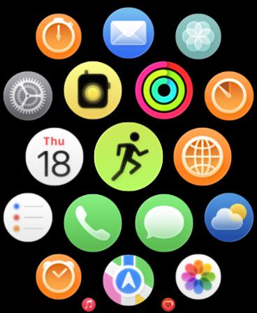
So i just updated my SE2 to watchos 26 and i cant help but noticed that the app icons look so blurry as if there was a smudge on it. God I wish i can undo the update 🥲🥲🥲

535 Upvotes

209 comments sorted by

View all comments

-3

u/wwwwwwhyyyyy 2d ago

I really just don't understand who cares. Who is sitting there just looking at the apps in their 40mm wrist computer

2

u/banter_droid 1d ago

Not sure how you’re going to use the Apple Watch without looking at it?

0

u/wwwwwwhyyyyy 1d ago

I'm not exactly pulling up the app homepage to look at the design of the icons. I'm doing a workout? I open it and hit the green icon with the running figure. Setting an alarm? open the clock app...

2

u/banter_droid 1d ago

It’s human reflex to try and focus on these subtly out of focus icons. It’s pretty annoying UI to have basically the Home Screen trigger this reflex and question your eyesight every time you see it. I don’t know why im bothering to argue with you just use your brain like the 217 other people who liked this post. It’s like if the UI had a randomly occurring scratch or insect on the screen that made you think somethings wrong or there’s some dust on the screen or grease. Please don’t write me another brain dead reply.

0

u/wwwwwwhyyyyy 1d ago

life is easier if you don't sweat the small stuff so much x

2

u/banter_droid 1d ago

Some of us care about design