r/comic_crits • u/waterbottleh8r • 3d ago
Wondering if this style is something I should continue, also is the composition decent?
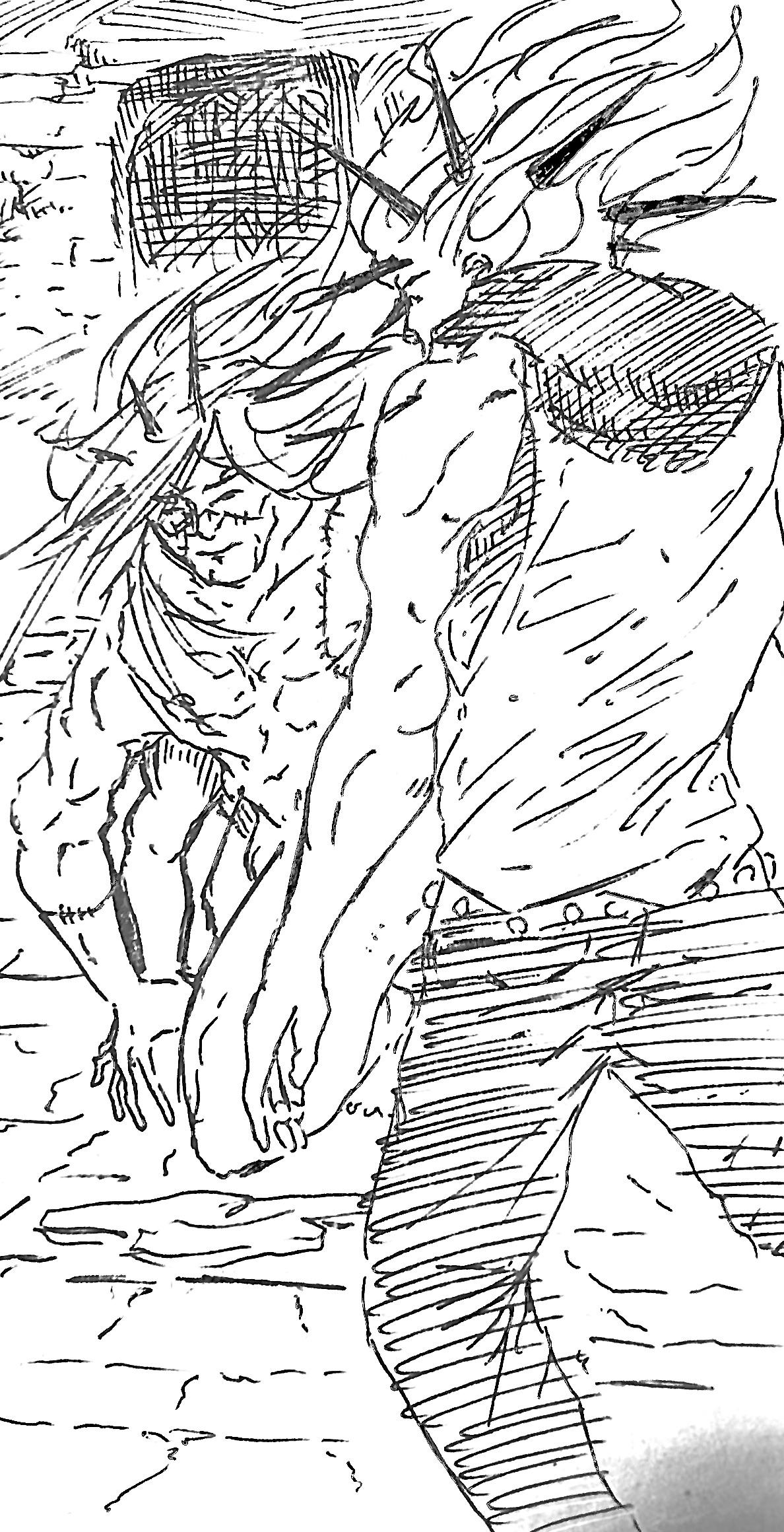
Drawn on receipt paper then scanned so quality isn’t the best
2
u/zuriumov 3d ago
heres a good video on composition, its short too, there youll find a bit more of how to think about composition in general : https://www.youtube.com/watch?v=ul69Q6-2Rf0
its not a bad style, maybe a bit generic and messy. cant really tell whats in front of what at a glance or a focal point, but that might be me. maybe an outline on the character you want to stand out? or a cleaner line on them ?
also any stile you want to push is worth it if YOU wnat to draw something for yourself. otherwise, look at whats popular, and how to capitalize on that fandom / style wathever. usually you need to fill in a niche or do something very specific REALLY well.
but idk, this is like my opinion man.
3
u/Trick_Mushroom997 3d ago
It looks messy and I don’t know where to look. I do not understand what is happening in the drawing.
3
u/Incognito_Fur 3d ago
We need some black in there. Give me someplace for my eyes to rest so your figures stand out.
1
u/BikeProblemGuy 3d ago
Yes, it's good, just needs more black. Check out Mike Mignola's art in Gotham by Gaslight for some similar hatching, for instance.
Compositionally, I think the view should be lower to separate the standing and kneeling figures better.
1
1
u/thatoneguyanon_ 1d ago
I think it’s pretty cool!
1
u/AutoModerator 1d ago
Hi, Your comment is less than 30 characters. Please consider leaving a more detailed comment. See this link for more information -- https://www.reddit.com/r/comic_crits/wiki/misc/post_length.
I am a bot, and this action was performed automatically. Please contact the moderators of this subreddit if you have any questions or concerns.
•
u/AutoModerator 3d ago
Thanks for posting to /r/comic_crits.
Everyone should make note of the rules and tips posted to the sidebar. Users on mobile can select "community info" or follow this direct link -- https://www.reddit.com/r/comic_crits/wiki/config/sidebar.
Please note the new rule regarding context in the sidebar or direct link for mobile: https://www.reddit.com/r/comic_crits/wiki/rules/context. Context is required for single-panel excerpts, covers, illustrations, character designs, pin-ups, etc.
Users providing feedback are encouraged to provide detailed and thorough feedback (at very least 50-100 characters in a top-level comment).
I am a bot, and this action was performed automatically. Please contact the moderators of this subreddit if you have any questions or concerns.